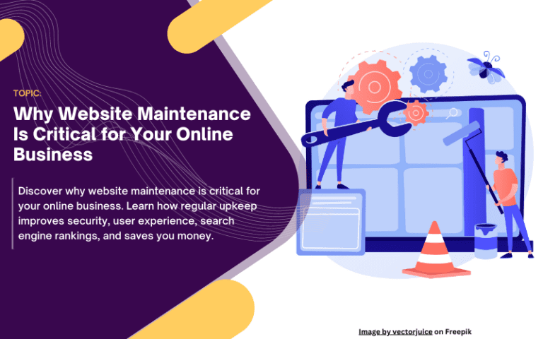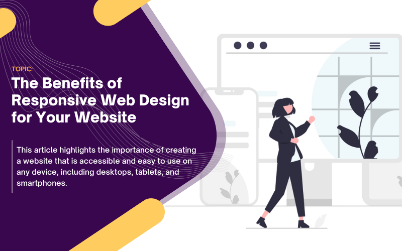
The Benefits of Responsive Web Design for Your Website
In today’s digital age, more people are using their mobile devices to browse the internet than ever before. Therefore, it is crucial to have a website that is responsive, which means it can adapt to different screen sizes and devices. In this blog post, we will discuss the benefits of responsive web design and why it is essential for your website.
What is Responsive Web Design?
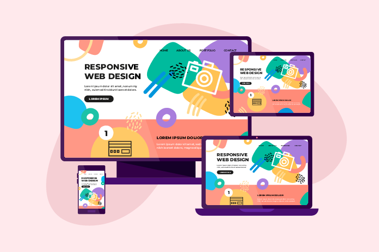
Responsive web design is a design approach that ensures a website is accessible on any device, regardless of the screen size or orientation. This means that your website will look and function the same on a desktop, tablet, or smartphone, providing an optimal user experience for your visitors.
What are the Benefits of Responsive Web Design?
- Improved User Experience
- Increased Mobile Traffic
- Lower Bounce Rate
- Cost-Effective
- Improved SEO
1. Improved User Experience

A responsive website will adapt to the user’s device, providing a seamless and consistent user experience. Users will not have to zoom in or scroll horizontally to view the website’s content, making it easier for them to navigate and find the information they need. A positive user experience will lead to increased engagement and a lower bounce rate, which is beneficial for your website’s search engine ranking.
In today’s digital world, user experience is key. Websites that are not designed with the user in mind can lead to frustration, confusion, and ultimately a poor user experience. That’s why responsive web design is so important. Responsive web design ensures that your website is optimized for any device, providing users with a seamless and consistent experience no matter what device they are using. Not only does this improve the overall user experience, but it also helps to increase engagement and conversion rates.
2. Increased Mobile Traffic

As mentioned earlier, more people are using their mobile devices to browse the internet than ever before. Therefore, having a responsive website will ensure that your website is accessible to a larger audience, leading to increased mobile traffic. This will result in more leads and sales for your business.
With the rise of mobile device usage, businesses need to make sure their website is up-to-date and responsive. Mobile traffic has increased significantly over the past few years and if your website isn’t optimized for mobile use, you’re missing out on potential customers. Having a responsive website that looks great on any device will ensure that you reach as many customers as possible.
3. Lower Bounce Rate

A high bounce rate is when users visit your website but leave immediately without interacting with any of the content. This could be due to slow load times, poor user experience, or content that is not relevant to the user. A responsive website will improve the user experience, leading to a lower bounce rate.
Having a high bounce rate on your website can be detrimental to your business. It means that users are visiting your website but not engaging with the content, resulting in lost potential customers and revenue. Fortunately, there are some tactics you can use to lower your bounce rate and improve user experience. This includes optimizing page loading times, improving the design of your website, and providing relevant content to keep users engaged. With these strategies in place, you can increase user satisfaction and ultimately drive more conversions from your website.
4. Cost-Effective

Having a responsive website eliminates the need for a separate mobile website, reducing development and maintenance costs. It also ensures that your website is future-proof, as it will adapt to any new devices or screen sizes that may be introduced in the future.
As technology advances, having a responsive website is becoming increasingly important. Not only is it cost-effective, but it also ensures that your website is accessible and viewable on all devices and browsers – providing the best possible user experience. Responsive websites are future-proof, eliminating the need for a separate mobile website and reducing development and maintenance costs. This can help you save time and money while still providing an optimal online presence.
5. Improved SEO

Google has stated that responsive web design is its recommended mobile configuration, as it makes it easier for Google to crawl and index your website’s content. A responsive website will also have a lower bounce rate, which is a positive ranking factor for search engines.
The importance of SEO has never been more prominent than it is today. With the rise of digital marketing, businesses need to stay ahead of their competition by optimizing their websites for improved search engine rankings. Having a responsive website design is now recognized as one of the best methods to improve your SEO, as it makes it easier for Google bots to crawl and index your website’s content. Responsive web design ensures that your website looks and functions correctly across all devices and screen sizes, giving users a seamless experience while they explore your site. This makes it easier for search engines like Google to find, crawl, and index all the important content on
Principles of Responsive Web Design?
Responsive web design follows several principles to ensure that websites can adapt to any screen size or device. These principles include:
1. Flexible Grids:
Flexible grids are revolutionizing the way websites are designed. They allow website content to be organized in a way that can adapt to any screen size, making for a more user-friendly experience. By using relative units, such as percentages, instead of fixed units, web designers can create more responsive layouts that will look great no matter the size of the device. This can help designers save time and energy while creating great-looking websites.
2. Flexible Images:
Images on a website should also be flexible and able to scale down or up as needed.
Flexibility and scalability are key attributes of modern web design. As such, images on a website should also be flexible and able to scale up or down depending on the size of the device they are being viewed on. This can be achieved using CSS techniques such as max-width and height: auto, which ensures that all images will look great regardless of their size. This is a must-have feature for any website looking to provide an optimal user experience.
3. Media Queries:
Media queries are used to apply different styles to a website based on the screen size or device. This ensures that the website is optimized for each device and provides the best possible user experience.
Media queries are an essential part of creating a responsive website. By using media queries, web developers can create websites that look and feel great regardless of the device or screen size. With media queries, web developers can easily optimize a website to fit different device sizes by applying different styles to the same website depending on the device. This ensures that users can have the best experience possible when visiting a website no matter what device they use.
4. Mobile-First Design:
In today’s world, it is essential that websites are optimized for mobile devices. Mobile-first design is a great approach to achieving this goal. This approach starts with designing for the smallest screen size first and then scaling up for larger devices. This ensures that the website looks great and provides an optimal user experience regardless of what device it is being viewed on. By focusing on mobile-first design, businesses can ensure that their websites are accessible to all users, no matter what device they are using.
5. Performance Optimization:
Responsive web design also involves optimizing the performance of a website to ensure that it loads quickly on all devices. This can be achieved by optimizing images, using caching techniques, and minimizing the use of external resources.
Performance optimization is essential for any website, especially in a world where customers expect pages to load quickly on all devices. Responsive web design helps optimize performance by optimizing images, using caching techniques, and compressing HTML & CSS files. This can significantly improve the speed of your website and enhance the overall user experience.
Why is Responsive Web Design Important?
Responsive web design is important for several reasons, including:
1. Improved User Experience:
The primary benefit of responsive design is that it provides a better user experience for visitors to your website. Responsive design ensures that your website is accessible and easy to use on any device, whether it’s a desktop computer, tablet, or smartphone. This can lead to increased engagement, lower bounce rates, and higher conversions.
2. Increased Mobile Usage:
In recent years, the use of mobile devices has surpassed desktop computers as the primary way people access the internet. A responsive design ensures that your website is optimized for mobile devices, which is critical given the growing number of mobile users.
3. Better SEO:
Google and other search engines prioritize websites that are mobile-friendly and responsive in their search results. A responsive design can improve your website’s SEO rankings, leading to increased visibility and traffic.
4. Cost-Effective:
Implementing a responsive design can be more cost-effective than creating separate desktop and mobile versions of your website. With a responsive design, you only need to create one website that works on all devices, rather than creating multiple versions.
5. Future-Proofing:
Responsive design is an important part of future-proofing your website. With new devices and screen sizes constantly emerging, a responsive design ensures that your website will continue to work well on any device.
6. Competitive Advantage:
A responsive design can give you a competitive advantage over businesses that have not yet adopted responsive design. By providing a better user experience and improving your SEO rankings, a responsive design can help you stand out from the competition.
Responsive design is an essential aspect of modern web design. It provides a better user experience, improves SEO rankings, and future-proofs your website. By implementing a responsive design, you can stay ahead of the curve and provide a better experience for your website visitors.
How to Implement Responsive Web Design?
Implementing responsive web design involves using CSS media queries to adjust the website’s layout based on the screen size. Ethan Marcotte coined the term “responsive web design” in his seminal article for A List Apart, where he introduced the concept of using fluid grids and flexible images to create a responsive layout.
There are also tools available to help you test the responsiveness of your website. Google’s Mobile-Friendly Test is a free tool that analyzes your website and provides a report on how mobile-friendly it is. Chrome’s DevTools also has a responsive design mode that allows you to test how your website looks on different devices.
Implementing responsive web design involves several steps. Here’s a step-by-step guide on how to implement responsive web design for your website:
1. Plan your design:
The first step in implementing responsive web design is to plan your design. Think about the layout, colors, and typography you want to use on your website. Consider how the content will be structured and how it will adapt to different screen sizes. Sketch out your design ideas or create a wireframe to get a better understanding of how your website will look on different devices.
2. Use fluid grids:
One of the key principles of responsive web design is using fluid grids. A fluid grid is a flexible grid system that adjusts to the size of the screen. It allows you to create a layout that is based on proportions rather than fixed pixel values. This means that the layout will adapt to different screen sizes without the need for media queries.
3. Use media queries:
While fluid grids are an essential part of responsive web design, they can only take you so far. Media queries allow you to fine-tune your design for specific screen sizes or devices. You can use media queries to adjust the font size, layout, and other design elements based on the screen size.
4. Use flexible images and media:
Images and media are an important part of any website, but they can be challenging to handle in responsive web design. One solution is to use flexible images and media that can adapt to different screen sizes. You can use CSS to specify the maximum width of an image or media element, ensuring that it does not exceed the size of the screen.
5. Test and optimize:
Once you have implemented responsive web design, it’s important to test your website on different devices to ensure that it works as intended. You can use tools like Chrome DevTools or Google’s Mobile-Friendly Test to check how your website looks on different devices. It’s also important to optimize your website for performance, as slow-loading pages can negatively impact the user experience.
Implementing responsive web design requires careful planning and attention to detail, but the benefits are well worth the effort. A responsive website ensures that your content is accessible and user-friendly on any device, leading to better user engagement and increased conversions.
Conclusion
In this digital age, having a website that is optimized for all device sizes is essential to providing a seamless user experience. Responsive web design ensures that your website looks great and functions optimally on any device. It leads to increased mobile traffic, lower bounce rates, and improved SEO, making it a cost-effective investment for any business. With responsive web design, businesses can provide their customers with an enjoyable online experience no matter what type of device they are using.